NetappSunnyvale, CA

SIZE: Multi-project

SCOPE: Environmental Graphics & Branding

Project description

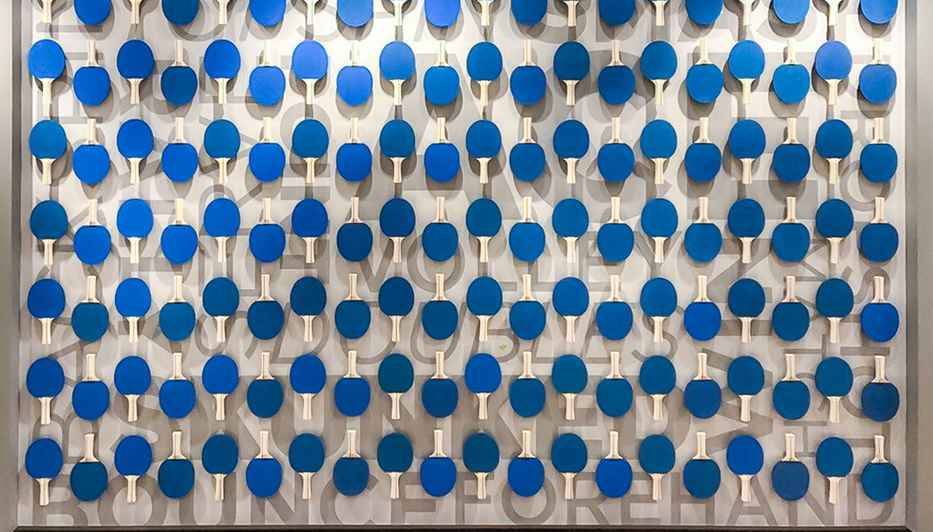
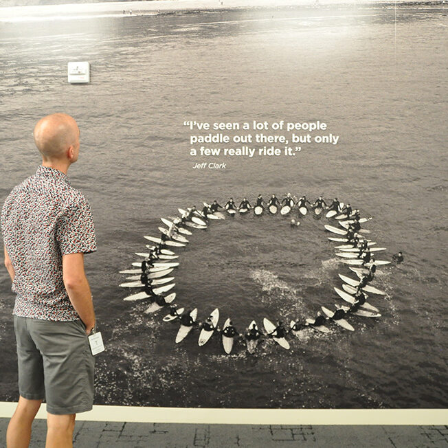
NetApp’s goal was to merge the technical and data-heavy side of their business with California’s iconic competition-driven, yet relaxed vibe.
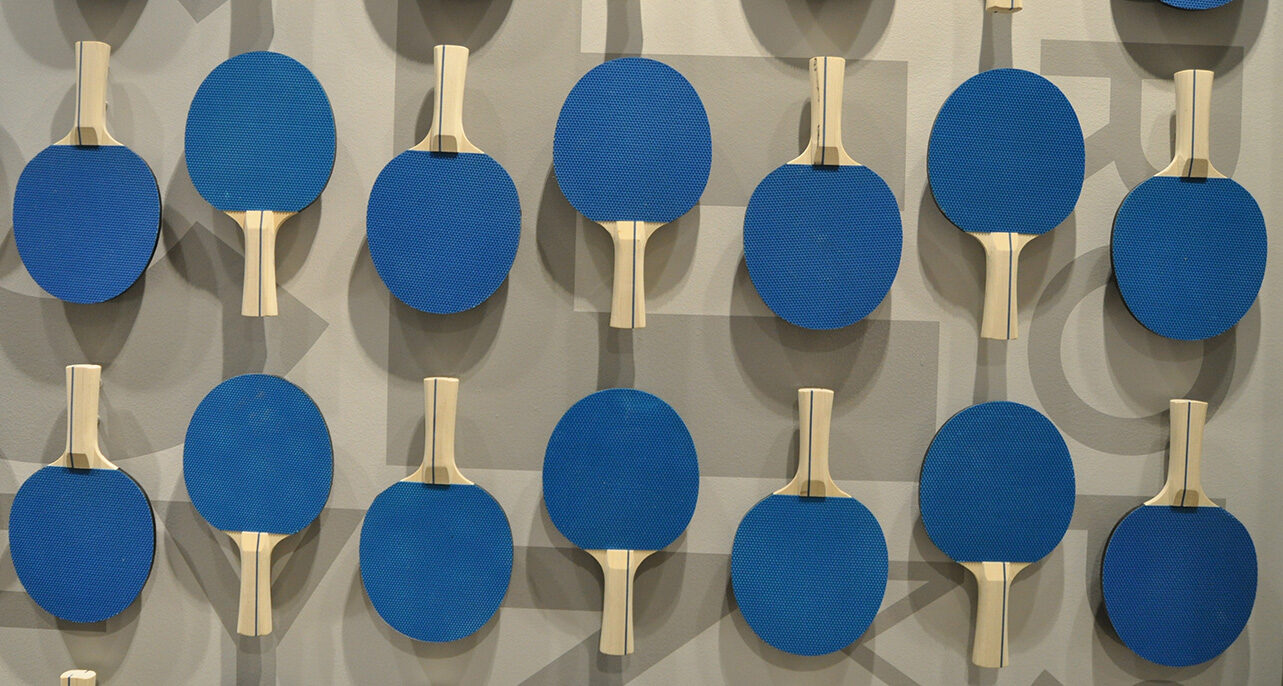
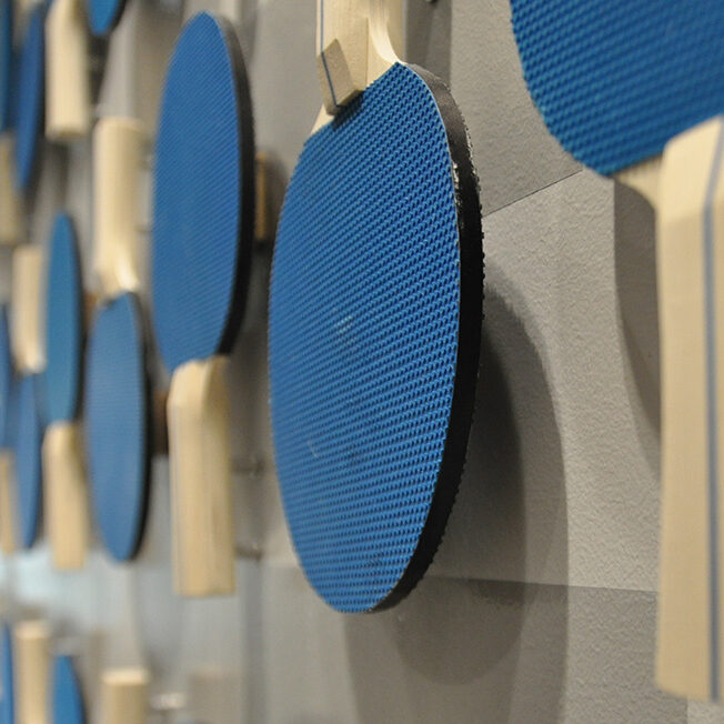
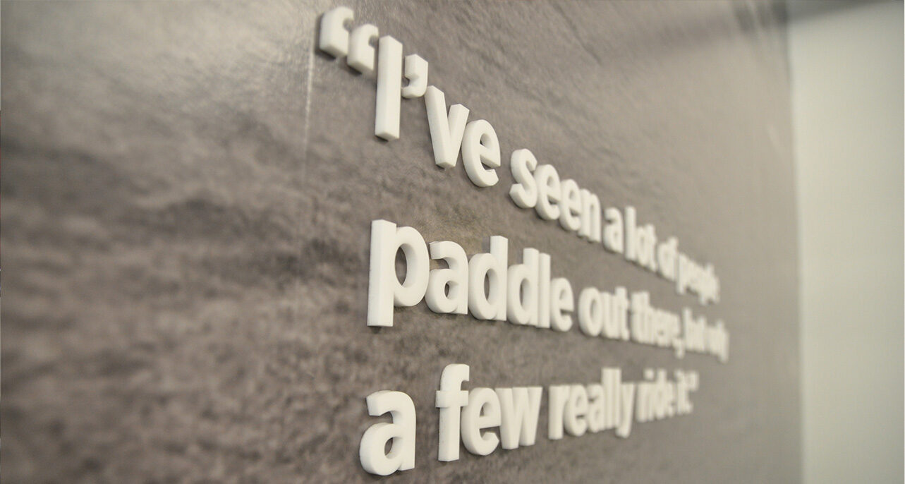
To achieve this, we used bold color and patterning cohesively throughout the space, juxtaposed data with large-scale imagery, and implemented niche art-moments evocative of NetApp’s “fabric of data” story.
Project insights

A challenging and rewarding component was the lenticular design. The particular design and construction allow three separate viewing perspectives: the first is straight on and depicts hurdling track and field athletes, emulating the company’s competitive “go get ‘em” culture and visualizing company diversity. The second and third perspectives spell the company tagline “data driven”; from the left you see “data” and from the right, “driven.” Each letter is made from actual software code written by Netapp engineers. The result is a dramatic and breathtaking feature element creating engagement and energy in the office.

Jamie’s project pride

My favorite part of Comcast is how real, dimensional materials were integrated with the 2D graphics to create something that felt larger than life and added a sense of wonder and texture. It was a really creative way to introduce brand color and maintain architectural aesthetic as well.

Kyle’s project pride

Living in Colorado, we get asked to design mountains all the time. I found a unique way to depict 14’ers by designing a wall grid of mountain peaks, depicting only the summit of each peak as a built line. As you get closer to the grid, a bit of an easter egg is waiting for you as the name and height is revealed.

OTHER WORK